Two of the things that I like the most about SQL Monitoring reports are the ability to quickly spot where in the execution plan the time is spent (Activity% column, thank you ASH) and the fact you can collapse part of the plan. Too bad the two don’t “work” together meaning if you collapse a part of the plan the Activity% is not rolled up at the collapsed level. I understand why it works that way (it might be confusing otherwise) but I’d still like to be able to collapsed a node and get a “subtree Activity%” so I know if that subtree is something I should be worry about or not (kind of…).
Pause that for a second, Flamegraph on the other hand is really good at showing how much (in %) a “subtree” (function + its callees) accounts overall, Luca Canali did an (as usual) awesome job here with something similar, but a bit more sophisticated than just execution plan. Unfortunately the fact the elements are not sorted on time (I think most “Oracle people” tend to expect time on the X-axis) combined with the kind of random color used for each bar make this representation a little less intuitive than I’d like it to be for execution plans (don’t get me wrong, I still love this representation a lot!).
SQLd360 represents execution plans as tree since one of the first releases and for over a year the color of the nodes represent a heatmap of where time has been spent (same as Activity% in SQL Monitoring), starting from a couple releases ago there are a couple improvements I hope (like to hear you feedback on this) fixed the shortcomings of both SQL Monitoring and Flamegraph when it comes to digest execution plans.
Each step in the execution plan can be collapsed (this was since day 1) and now its color will change to represent the color the node would have had if all the time the SQL spent on the node itself plus its child steps was spent on the node itself, on expand the colors go back to original.
Also when mouse overing the node a new piece of info will show up in the popup, a “subtree impact” that represent exactly what % of time the node plus its children account for.
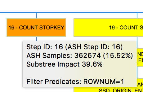
For example from the picture above step 16 accounted for 15.52% of the time, while all the subtree under the node (including it too) accounted for 39.6% of the time. Expanding the node the color will go back to a “lighter shade orange”.
I think one of the main advantage of this approach will be the ability to consume large execution plans quickly, collapsing large parts of them and focusing on just what matters, how those parts of the plan interacts with each others, etc etc.
As usual feedbacks, corrections, ideas are MORE than welcome! 🙂
NB: I rewrote the SQL that is under the tree representation to make it more readable but just to make sure I didn’t break the functionality as of now there are two plan trees per plan (and per Top N exec), the one “with subtree” implements what just described above. The old representation will go away down the road, when I’m sure the new SQL is solid enough.

April 15, 2017 at 10:29 am
nice!
can you also re-post it on orapeeps?
>
LikeLike
April 15, 2017 at 1:42 pm
Yes but you need to show me how 😦
LikeLike
April 15, 2017 at 4:31 pm
Awesome thanks for this Mauro, will try out this out on a few of our complex sql and let you know. Greg O
LikeLike
April 15, 2017 at 4:35 pm
Cool! Keep me posted on how it goes!!
LikeLike